OpenSilver.Blazor
Table of Contents
- Introduction
- Key Features
- Getting Started & Project Configuration
- Usage Examples
- Tips & Best Practices
- Threading Considerations
- Known Limitations & Release Notes
1. Introduction
OpenSilver.Blazor is a library that enables you to seamlessly embed Blazor components within your OpenSilver applications. Blazor is a powerful framework with a vibrant community and a rich ecosystem of ready-made components. By integrating Blazor into OpenSilver, we unlock the ability to reuse existing Blazor assets while leveraging the shared .NET technology stack.
Sample Project
A complete sample project demonstrating all key concepts is available on GitHub:
This sample includes six progressive examples: inline Razor, data binding, external .razor files, editable data tables, Radzen DataGrid, and event handling.
2. Key Features
Embed Razor Code Directly in XAML
Place Razor code blocks directly within XAML using the
<RazorComponent>tag.Note: Razor code embedded inside XAML will show errors in Visual Studio at design-time, but will compile and run correctly. Read more in the Known Limitations section.
Reference External Razor Components
Use Razor components defined in separate
.razorfiles via theComponentTypeattribute:<RazorComponent ComponentType="{x:Type local:Counter}" />Note: Make sure the Build Action of the
.razorfile is set toContent.Support for 3rd Party Blazor Libraries
Integrate popular Blazor UI libraries (such as Blazorise, MudBlazor, Radzen, DevExpress Blazor UI, Syncfusion Blazor Components, and Microsoft QuickGrid) seamlessly into your OpenSilver app.
XAML Bindings in Razor Code
Use XAML data bindings within Razor code. The
Typeattribute is required for bindings to work.Multi-Launcher Compatibility
Works with
.Browser,.MauiHybrid, and.Simulatorlaunchers.Most stable experience is currently for
.Browserlauncher.
3. Getting Started & Project Configuration
Prerequisites
- Version 3.3 or newer of the OpenSilver and OpenSilver.Blazor packages
- .NET 8, .NET 9, .NET 10 or newer
Installation Steps
Install the NuGet Package: Add the
OpenSilver.BlazorNuGet package to any project where you want to use Blazor components.Update your project SDK: In your
.csproj, change:<Project Sdk="Microsoft.NET.Sdk">to
<Project Sdk="Microsoft.NET.Sdk.Razor">Initialize Blazor for OpenSilver:
Add the following to theProgram.Main()method in the .Browser project:Initializer.UseBlazorForOpenSilver(builder);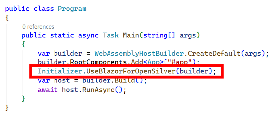
If you use MAUI-Hybrid (to deploy to iOS, Android, Windows, macOS):
Add the following at the end of theMainPage.xaml.csconstructor in the .MauiHybrid project (if applicable):Initializer.UseBlazorForOpenSilver(blazorWebView.RootComponents);Add the Razor namespace to your XAML:
xmlns:razor="clr-namespace:OpenSilver.Blazor;assembly=OpenSilver.Blazor"Add 3rd Party Blazor Libraries (Optional):
Install any Blazor library (e.g., Blazorise, MudBlazor, Radzen, DevExpress Blazor, Syncfusion Blazor) following their own installation instructions.
4. Usage Examples
Below are a few usage examples. For a complete working project with all examples, see the OpenSilver_Blazor_QuickStart repository on GitHub.
A. Simple Embedded Razor Code with Data Binding
1. XAML Integration (MainPage.xaml)
<UserControl
    x:Class="MyApp.MainPage"
    xmlns="http://schemas.microsoft.com/winfx/2006/xaml/presentation"
    xmlns:x="http://schemas.microsoft.com/winfx/2006/xaml"
    xmlns:razor="clr-namespace:OpenSilver.Blazor;assembly=OpenSilver.Blazor"
    xmlns:local="clr-namespace:MyApp">

    <razor:RazorComponent>
        <h3>Hello, Blazor!</h3>

        <p>Message from the Model: "{Binding Message, Type=String}"</p>
    </razor:RazorComponent>
</UserControl>
2. Code-behind (MainPage.xaml.cs)
public partial class MainPage : UserControl
{
    public MainPage()
    {
        this.InitializeComponent();

        this.DataContext = new Context();
    }
}

public class Context
{
    public string Message { get; set; } = "Hi!";
}
3. Notes
- The
Typeattribute is required for the binding to work.
B. Using a 3rd Party Blazor Button (Radzen Example)
This example demonstrates how to use a Radzen Blazor button inside a XAML UI, including the required setup for 3rd-party Blazor libraries.
1. XAML Integration (RadzenButton_Demo.xaml)
<UserControl
    x:Class="MyApp.RadzenButton_Demo"
    xmlns="http://schemas.microsoft.com/winfx/2006/xaml/presentation"
    xmlns:x="http://schemas.microsoft.com/winfx/2006/xaml"
    xmlns:razor="clr-namespace:OpenSilver.Blazor;assembly=OpenSilver.Blazor"
    xmlns:local="clr-namespace:MyApp">

    <StackPanel>
        <razor:RazorComponent Margin="0,20,0,0" Height="70">
            @using Radzen
            @using Radzen.Blazor

            <RadzenButton Text="Click me!" Click="{Binding ButtonClickDel, Type=Action}" />
        </razor:RazorComponent>
    </StackPanel>
</UserControl>
2. Code-behind (RadzenButton_Demo.xaml.cs)
public partial class RadzenButton_Demo : UserControl
{
    public RadzenButton_Demo()
    {
        InitializeComponent();
        DataContext = new TestButtonClickClass();
    }
}

public class TestButtonClickClass
{
    public Action ButtonClickDel { get; }

    public TestButtonClickClass()
    {
        ButtonClickDel = ButtonClick;
    }

    private void ButtonClick()
    {
        MessageBox.Show("You clicked me!");
    }
}
3. Additional Configuration for Radzen.Blazor
To use Radzen components, some additional setup is required in your .Browser project:
a. Add the Radzen JS Script
In
index.html(inside the<head>section):<script src="_content/Radzen.Blazor/Radzen.Blazor.js"></script>b. Register Radzen Services
In
Program.cs, add the following beforebuilder.Build();:builder.Services.AddRadzenComponents();c. Apply Radzen Styles
In one of your XAML files which will be loaded with or before the Radzen Component, add the following:
<razor:RazorComponent>
  @using Radzen
  @using Radzen.Blazor
  <RadzenTheme Theme="material" />
</razor:RazorComponent>
Tip: Use
Theme="material-dark"for dark-themed applications.
4. Notes
- Ensure you've installed the
Radzen.BlazorNuGet package in your project. - The example uses XAML data binding to connect the button click event to a C# handler via
ButtonClickDel. - If you use other 3rd-party Blazor libraries (e.g., MudBlazor, Blazorise), consult their documentation for similar setup requirements.
C. Using a Ready Razor Component from Another File
1. XAML Integration (MyControl.xaml)
<UserControl
    x:Class="MyApp.MyControl"
    xmlns="http://schemas.microsoft.com/winfx/2006/xaml/presentation"
    xmlns:x="http://schemas.microsoft.com/winfx/2006/xaml"
    xmlns:razor="clr-namespace:OpenSilver.Blazor;assembly=OpenSilver.Blazor"
    xmlns:local="clr-namespace:MyApp">

    <razor:RazorComponent ComponentType="{x:Type local:Counter}" />
</UserControl>
2. Blazor Component (Counter.razor)
<h3 style="margin-top:0">Counter</h3>

<p>Current count: @currentCount</p>

<button class="btn btn-primary" onclick="@IncrementCount">Click me</button>

@code {
    int currentCount = 0;

    void IncrementCount()
    {
        currentCount++;
    }
}
3. Notes
- Make sure the Build Action of the
.razorfile is set toContent. - Use
onclick="@MethodName"syntax (HTML attribute with Razor expression) for event handlers in.razorfiles.
D. Accessing Blazor Component via code
1. XAML Integration (MyControl.xaml)
<UserControl
    x:Class="MyApp.Message_Demo"
    xmlns="http://schemas.microsoft.com/winfx/2006/xaml/presentation"
    xmlns:x="http://schemas.microsoft.com/winfx/2006/xaml"
    xmlns:razor="clr-namespace:OpenSilver.Blazor;assembly=OpenSilver.Blazor"
    xmlns:local="clr-namespace:MyApp">

  <razor:RazorComponent x:Name="DatePickerHolder" Margin="0,20,0,0" Height="60">
    @using Radzen
    @using Radzen.Blazor

    <RadzenStack Orientation="global::Radzen.Orientation.Horizontal" JustifyContent="global::Radzen.JustifyContent.Center" AlignItems="global::Radzen.AlignItems.Center" Gap="0.5rem">
      <RadzenLabel Text="Select Date" Component="RadzenDatePickerBindValue" />
      <RadzenDatePicker @ref="myDatePicker" TValue="DateTime?"  Name="RadzenDatePickerBindValue" ShowCalendarWeek />
    </RadzenStack>

    @code {
      public RadzenDatePicker<DateTime?> myDatePicker { get; set; }
    }
  </razor:RazorComponent>
</UserControl>
2. Code-behind (MyControl.xaml.cs)
In your code-behind, you can then access the Blazor Component:
dynamic datePicker = ((dynamic)DatePickerHolder).Instance.myDatePicker;
datePicker.DateFormat = "MM/dd/yyyy";
3. Notes
- By naming the RazorComponent (here DatePickerHolder), you can access it from the code-behind.
- You can then access the Razor component (defined here by the contents of DatePickerHolder) via the "Instance" property.
- Having
@ref="myDatePicker"on the RadzenDatePicker then lets us access it from the Razor Component through the myDatePicker property defined in the @code section.
5. Tips & Best Practices
Call StateHasChanged() After Modifying Data
When you modify data in your @code block that should trigger a UI update, call StateHasChanged():
@code {
    private List<Item> _items = new();

    private void AddItem()
    {
        _items.Add(new Item { Name = "New item" });
        StateHasChanged();  // Required to refresh the UI
    }

    private void DeleteItem(Item item)
    {
        _items.Remove(item);
        StateHasChanged();  // Required to refresh the UI
    }
}
Use Inline Styles Instead of Scoped <style> Tags
For more predictable styling in OpenSilver.Blazor, prefer inline styles on elements rather than scoped <style> tags within .razor files:
<!-- Recommended: inline styles -->
<button style="background: #0E639C; color: white; padding: 8px 16px;">
    Click me
</button>

<!-- May have inconsistent behavior -->
<style>
    .my-button { background: #0E639C; }
</style>
<button class="my-button">Click me</button>
Event Handler Syntax
For event handlers in .razor files, use the HTML attribute syntax with a Razor expression:
<!-- Recommended syntax -->
<button onclick="@HandleClick">Click me</button>

@code {
    void HandleClick()
    {
        // Handle the click
    }
}
Binding Events to ViewModel Methods
When binding Blazor events to ViewModel methods from inline XAML, use the Type attribute:
<razor:RazorComponent>
    <button onclick="{Binding OnClick, Type=Action}">Click me</button>
</razor:RazorComponent>
6. Threading Considerations
Running Blazor Code on the Correct Thread
When running OpenSilver.Blazor in certain environments, specifically MAUI Hybrid, the Simulator, and the XAML Designer, Blazor components and logic must be executed on a dedicated Blazor thread. This is required due to differences in the threading models of these platforms.
To ensure maximum compatibility and a consistent experience across all launchers, we highly recommend that any code interacting with Blazor components is always executed on the Blazor thread. This approach avoids threading issues and ensures your UI updates work reliably everywhere.
The BlazorThread Utility
The OpenSilver.Blazor.Threading.BlazorThread class provides methods for running code on the Blazor thread. You should use these methods whenever you need to update Blazor components or call APIs such as StateHasChanged from outside of Razor code.
Example:
To safely call the Blazor StateHasChanged method, use:
OpenSilver.Blazor.Threading.BlazorThread.BeginInvokeOnMainThread(this.StateHasChanged);
This guarantees that StateHasChanged runs on the Blazor thread, preventing cross-thread exceptions and UI update issues.
Tip: For best results and future compatibility, always use
BlazorThreadfor any code that updates or interacts with Blazor components from outside of their normal lifecycle methods.
7. Known Limitations & Release Notes
Design-Time Errors: Razor code embedded inside XAML will show errors in Visual Studio at design-time, but will compile and run correctly. You can work around this issue by:
- Putting your embedded razor code inside a CDATA section, such as:
<razor:RazorComponent> <![CDATA[ Put your razor code here ]]> </razor:RazorComponent> - Or placing Razor code in separate
.razorfiles and referencing them via theComponentTypeattribute (see Key Features) - Or hiding design-time errors in Visual Studio by choosing "Build only" in the "Error List" window, as shown in this screenshot:

- Putting your embedded razor code inside a CDATA section, such as:
Launcher Support:
.Photinolauncher is not supported. Behavior may differ across.Browser,.MauiHybrid, and.Simulator.Designer Support: The XAML Designer may not reliably preview Razor components.
Language Support: Currently, OpenSilver.Blazor works only for C# projects.
If you have a VB.NET or F# project, you can work around this limitation by creating and referencing a separate C#-based OpenSilver class library project, and placing your Razor files inside that class library.Troubleshooting: Please report issues on GitHub, or contact us.
See Also
- Sample Project: OpenSilver_Blazor_QuickStart on GitHub
- Live Examples: OpenSilverShowcase.com (includes MudBlazor, Radzen, Blazorise, DevExpress, and Syncfusion demos)
- Showcase Source Code: github.com/OpenSilver/OpenSilver.Samples.Showcase